July 18, 2007
I never thought I would say this, but...
...the Sacagawea dollar coin was very nice.
However, this is only because it has been surpassed in crappiness by the new dollar coin.
I had to stop and get stamps this morning, and the machine spit back out two of the new Presidential dollars as part of the change. Now, for all the insipid, new-agey touchifeeliness of the Sacagawea coin (Indian woman with a BABY! Ooooh, fer KUUUUTE!), it did at least look like some form of actual currency.
When these two new coins were retrieved from the chute, I honestly thought that they must be some sort of new Postal Service stamp tokens.
The reverse of the coin, which the Mint breathlessly describes as having a "striking rendition of the Statue of Liberty" simply looks cheap.
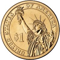
Sorry, Guy Who Designed It, but that's my opinion.
The off-center, 3/4 profile Liberty with the $1 bug sniffing her armpit looks slapped together by one of those weird little countries that puts Elvis on their coins. There's too much dead space in the composition, and as I have continually railed against, anything other than a profile or full face on a coin looks absolutely stupid. Low bas-relief does not allow the subtle shading that shows up on the proof-sketch versions of coins. Yes, it works fine on paper currency (and on stamps) because you're able to use engraving to get incredibly fine detail and shading, but it does NOT translate to coins with their variable shininess and the tiny amount of actual relief that can be struck.
Same thing with the front image, in this case of John Adams.
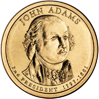
The sketch image looks okay, but in the three-dimensional world, he winds up looking like Porky Pig. Look, if you're going to insist on designing coins as 2-D paintings rather than as 3-D sculptures, it'd be better to come up with some way to apply a painting on the face of the coin. Which is a stupid idea, but no worse than trying to make American currency some sort of silly collectible memento like one of those "railroad penny" machines at the arcade or a Naughty Nellie from the service station restroom.
And again, the same gripe with the back applies to the obverse as well, with the relatively huge amount of "white" space around the image making it look like a bigger picture was out of the budget. Of course, the stuff that usually fills in the white space--date, mint mark, and motto--is now moved to the special incused edge. OOoooohh--edge incusing! Yet another lame idea--it's illegible without a magnifying glass, in circulation it'll get worn off quickly, and it serves absolutely no purpose at all. It's not big enough to be decorative, it doesn't have any "feel" to it like reeding.
And finally, this "golden" color thing must go. In circulation, these coins get ratty-looking quickly, adding to their aura of tokeny cheapness.
I'm tired of this. I don't want my money to have the feel of a souvenir. I have no desire for it to be used as a changing billboard of decorator-inspired kitsch to satisfy some Mint mugwump's desire to emulate the success of the stamp-collecting set. Look, when you decide to commemorate everything, nothing is special anymore. How much longer will it be before the Mint comes up with some way for each person to have his or her own image on a quarter or a nickle? I mean, if it was almost good enough for the Post Office, can the Mint be far behind?
Enough, folks.
Posted by Terry Oglesby at July 18, 2007 09:39 AMAt least they are tryingI want a dollar coin, no dollar bills, perhaps a real two you can use and colored money. Oh and for Terry it would need to pretty.
Posted by: jim at July 18, 2007 10:23 AMOn a positive note, I assume these are legal for game play at Chuck E. Cheese?
Posted by: skinnydan at July 18, 2007 10:58 AMI'd like a dollar coin, too. Reserve quarters for commemorative stuff if they must, or maybe use them for Reagan. The dollar coin should have a profile of Washington on the obverse, the Great Seal on the reverse, a skip-reeded edge, and be bi-metallic with a inner disc that won't discolor, and a nickel outer ring.
Paper currency can be colored, I don't mind so much, but it needs to not look like European play money like it does now.
Posted by: Terry Oglesby at July 18, 2007 10:58 AMAnd Dan, as for Chuck, I'd say he'd probably take them, although they don't look as nice as his tokens.
Posted by: Terry Oglesby at July 18, 2007 11:02 AMOhhh, I think Porky Pig will be appropriate after the Chinese economy tanks and they take us down with them ... a dee un dee un dee that's all folks!
While maybe not enough to put a significant dent into the national debt, all those quarters sitting in pretty little binders in people's closets is helping out the government. You know they're licking they're lips over "collectible" dollar coins. But what theme? They probably won't use the 50 states, US Presidents or Native Americans.
Hmmm ... Revolutionary War heroes? Naah, too many white guys. Supreme Court Justices? Same problem. I've got it: UN Secretary Generals. Get them now before they're gone!
Posted by: Marc V at July 18, 2007 12:00 PM[I put HTML code to strike through Indians but it did not seem to take. Oh well.]
(Not sure why that didn't work, Marc. I just snipped it out instead, although I know that's not what was supposed to happen--Ed.)
Posted by: Marc V at July 18, 2007 12:02 PMWell, the obvious choice would be NASCAR dollar coins.
Posted by: Terry Oglesby at July 18, 2007 12:07 PMI think the U.S. Mint could at least try a design something like the Canadian two-dollar coin which I think works VERY well.
I agree with you that this new U.S. dollar coin is worse than its predecessor, which I wasn't all that wild about either. Maybe we should just adopt a smaller version of the old "Ike" dollars.
Posted by: Stan at July 18, 2007 12:58 PMThat's the sort of coin I was thinking about, too--bi-metallic, with intermittent reeding. The 1 euro coin is also in the same mold, although I like the inside portion to be copper-brass-"golden" and the outer ring to be silvery-colored. I'm not taken with the Canadian $2 coin, though, because the imagery is a bit sparse and the Queen's head looks too tiny.
Posted by: Terry Oglesby at July 18, 2007 01:06 PMWhoever did the designs of the presidents did a very bad job. Sorry, but it's true. Looks like someone's "talented" high school kid and we all have to be nice about it.
And speaking as someone who has to carry around a pocket full of coins to ride the bus, I do not want to add a handful of dollar coins to the pile. Let me keep my dollar bills, in my wallet, where they belong!
Posted by: mike hollihan at July 18, 2007 02:27 PMIf you had a prepaid transit card, you wouldn't need folding money OR coins. Do they have card readers on your buses?
Posted by: Terry Oglesby at July 18, 2007 02:51 PMYou know, that's a great idea! We used to have prepaid cards the drivers would punch, but for reasons unknown they stopped. I guess having to punch tickets wasn't in the union contract.
I guess MATA (the Memphis busses) prefers a cash-only business. Hmmmmm....
Posted by: mike hollihan at July 18, 2007 04:04 PMIt sure does seem like it would be easier for everyone concerned--not as much change to count and all. I saw on the MATA website that they had passes, but using a PayPass-type card reader would be even quicker since the driver wouldn't have to check it.
Posted by: Terry Oglesby at July 18, 2007 04:21 PM